Repository navigation
Redesign the php.net homepage - #2105
mattstauffer wants to merge 14 commits into
Conversation


# Conflicts:
#	public/index.php


|
📊 Regression report for commit dba96e0 is at https://web-php-regression-report-pr-2105.preview.thephp.foundation |
|
🚀 Preview for commit dba96e0 is available at https://web-php-pr-2105.preview.thephp.foundation |

 TimWolla
left a comment
TimWolla
left a comment
There was a problem hiding this comment.
The updated styles resulted in a horizontal scrollbar for the Duration example on the release page for me:

While doing the release page, I've carefully hardwrapped the code so it's not scrollable (and without introducing too many weird breaks). Can we get just a little bit of additional width there?
| <h2 id="history-heading" class="section-title section-title--small">PHP through the years.</h2> | ||
| <p class="history__hint"> | ||
| <svg viewBox="0 0 24 24" fill="none" stroke="currentColor" stroke-width="1.5" stroke-linecap="round" stroke-linejoin="round" aria-hidden="true"><path d="M9 7l-5 5 5 5M15 7l5 5-5 5M4 12h16"/></svg> | ||
| <span>Three decades of releases. Drag, scroll, or use your arrow keys to explore. Open any version for its notes, or <a href="/manual/history.php.php">read the story</a>.</span> |
There was a problem hiding this comment.
The icons for the features here are inconsistent with the icons used on the actual release page. Puzzle vs Questionmark for PFA as an example.

 morrisonlevi
left a comment
morrisonlevi
left a comment
There was a problem hiding this comment.
Small thing: can't find the source for it, but I think this:
Made for the web. From the beginning.
Should just be:
Made for the web from the beginning.
It's better grammar and not everything is doing the two-sentence thing already, no reason to shoe-horn it in, I think?

|
|
||
| <section id="history" data-release-history aria-labelledby="history-heading" class="history"> | ||
| <div class="container history__intro"> | ||
| <h2 id="history-heading" class="section-title section-title--small">PHP through the years.</h2> |

There was a problem hiding this comment.
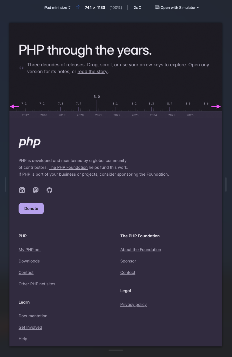
This section is interesting, but it is not clear for a user that this has a horizontal scroll. I am also not in favor that this breaks beyond the container (by default). Perhaps we can utilise the outers of the container to indicate that a scroll here is possible?
| <ol role="list" aria-label="PHP release milestones" aria-describedby="history-help"> | ||
| <?php foreach ($history['releases'] as $i => $release): ?> | ||
| <li class="history__release" style="left: <?= $release['left'] ?>px"> | ||
| <a draggable="false" data-history-release<?php if ($release['url']): ?> href="<?= $release['url'] ?>"<?php endif; ?> title="<?= $release['title'] ?>" aria-label="<?= $release['title'] ?>"<?= $i === array_key_last($history['releases']) ? '' : ' tabindex="-1"' ?> class="history__mark<?= $release['major'] ? ' history__mark--major' : '' ?>"> |
There was a problem hiding this comment.
Perhaps a tooltip (e.g tippy.js) to give more information, than relying on title/aria-label to give it more of an active feel.
| */ | ||
| return [ | ||
| '1.0' => ['label' => 'PHP Tools 1.0', 'date' => '1995-06-08', 'url' => 'https://talks.php.net/hhs'], | ||
| '2.0' => ['label' => 'PHP/FI 2.0', 'date' => '1997-11-12', 'url' => 'https://talks.php.net/show/oscon2002/5'], |
There was a problem hiding this comment.
This link is very buggy. It keeps refreshing.


|
I like it. It looks a lot like TailwindUI's old components, but there's nothing inherently wrong with that. It's a big improvement. I might increase spacing above the "POWERED BY PHP" title and decrease spacing below it to visually balance the top and bottom padding of the section. |

|
If the goal of this redesign is to make the PHP homepage completely indistinguishable from every other AI slop website generated in 30 minutes from a single prompt, it's extremely effective 👍 |

One thing that makes this feel odd to me is that you can't see the scroll bar until you try to scroll it. In some cases (and on some devices) it's really obvious, but in others less so. I also have a horizontal scroll bar for just the 8.6 version of the polling api, even though the content is comfortably in the pane. |

|
The timeline at the bottom is a wonderful touch, great job! Everything else like it was left to AI. Why is that? PHP is one of the most influential and important programming languages in the world. We deserve a design that champions that legacy. Take a look at the website designs of Ruby, Go, and Rust. Every single one has personality while maintaining a cohesive design. This design is going to look outdated in the coming 6-12 months because it favors looks over relevant meaning:
In terms of accessibility, I can only speak for myself because I have astigmatism, but the contrast in the colors is pretty difficult on my eyes. The section that does it best is the "Built by people. Open by design." section. The purples are strong and differ enough from the background to establish a clear difference. The borders and lines on the page are too much. For someone with astigmatism, scrolling past the page leaves a blur or a spot similar to a car's windshield wiper. I understand this is the work of unpaid volunteers, so I'm very grateful for their time. If anything can be taken from this comment, please let it call attention to the contrast in colors throughout the site in light mode and the overuse of borders and lines in the page. Thank you very much once again. PHP deserves a wonderful website because of its role in the history of the web. Please let us know how we can help! |

|
The powered-by section is a little iffy. I would think an org is, in some sense, powered by PHP if a majority of the code that powers their website backend is written in PHP. I don't think it's sufficient to have a company blog powered by WordPress, as that would include most of the Fortune 500. If we applied the that rule to the list it would rule out NYTimes, Asana, Zillow and DHL (seems only the NL site uses Drupal). Etsy and Wikipedia are safely PHP, and Nasa.gov and Der Spiegel seem like a safe bet too. Unsure about the others. From the websites that went down due to the PHP outage, you could maybe add the BBC to the list, and also various government websites. |

| } | ||
|
|
||
| $label = $override['label'] ?? "PHP $branch"; | ||
| $years = $origin->diff($date)->days / 365.25; |

There was a problem hiding this comment.
Why are we manual extrapolating the years from the days when the $y property exists on DateInterval?
Also you reuse the $years variable later with completely different context.
| $data = $json ? json_decode($json, true) : null; | ||
| $totals = is_array($data) ? ($data['totals'] ?? null) : null; | ||
|
|
||
| if (!is_array($totals)) { | ||
| return self::FALLBACK; | ||
| } |
There was a problem hiding this comment.
Would it be better to JSON_THROW_ON_ERROR here and exit early, instead of juggling null around untill we finally decide to return fallback.

|
Good job! PHP deserves some love ❤️ |

|
Is this redesign just for the homepage? I always find it incredibly jarring to see a modern homepage like this only to be sent back to 2012. |

|

|
@divinity76 - it actually has a dark theme |

|
Other requests from other formats that I'll move into here:
The conference note was passed to me elsewhere, and that person suggested we may replace "Get Involved" in the top nav with "Community" that has a broader page that pushes people out to things like "Get Involved" and community/events. Another:
Quick answer RE accessibility: Yes, I've done a bunch of manual audibility audits using the WAVE plugin, but I'd love help doing further checks! |

|
I noticed that this drops all references to conferences/user groups from the home page, so community event traffic from there goes from "some" (source: Google Analytics on Longhorn PHP's website over the years) to zero. Quickest way to fix this IMO, and I realize that the top nav is the way it is in this PR because it's a copy of the old top nav, would be to swap "Get Involved" for a "Community" menu with the following submenu items, not necessarily in this order:
Re: php.ug, I realize that's pushing people off-site, but right now that's the most actively-maintained hosting-neutral list of PHP user groups that I know of, and linking to the existing user groups page on the site would land people on a page with some very stale data. This needs fixing, but should be s separate effort than the home page rebuild; once this lands the UGs page can get a rebuild with both current data and a skin matching the new look and feel. If helpful, I can PR these changes, but I figure they're simple enough to describe/dev that I'd write them up here before stacking on another changeset. |

|
Oh, it's a PHP repo. I thought this was Laravel... To stay more on trend, there are three todo items:
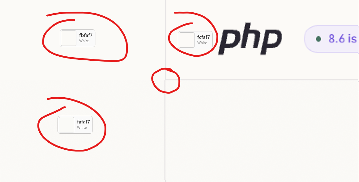
Sorry, it's awful. Just an opinion. |

|

|
This is exactly the modern design that PHP has been needing for ages! I know the following is out of scope, but expanding this to docs and all other pages should absolutely be a follow-up task! Way to go @mattstauffer! |

|
Design I agree with the comment above on light/dark mode. I'd stick with the icon on the current 8.6 page since it's clearer and consistent. I'd recommend moving the "8.6 is here" content out of the header area since it doesn't look like page content and is easy to miss. You could use an announcement block instead for this type of content? I'd also recommend making this content visible on mobile. On mobile the Composer & Packagist icons overlap the versions & stats boxes above. I think more than 1 news item is needed. I'd really like to see critical security news posts on the homepage (I'm sure CTOs will too). Perhaps always display recent critical security news posts + 1 or 2 other news posts on the homepage? I do think its a shame to loose the community/conference links. At least a clear link to another page would be nice. Code examples Things like SplFileObject are not well documented anyway, which compound this problem. I confess I wasn't aware of the Is there any scope for additional information (or a linked page) to add links to useful documentation on how to use this code or suggested Composer packages to use with this? Just a short hint on what you need to make this code work. Accessibility
Also, on the new 8.6 page the lighter text on the strapline starting "PHP 8.6 is a major update.." is hard to read due to the variable colour background. I don't think changing text contrast mid-sentence adds anything here so keep all the text darker. Same comment for the "More expressive code.." line. I really like this tool for colour contrast testing: https://vispero.com/lp/color-contrast-checker/ |


There was a problem hiding this comment.
I think it's an incredibly misguided decision to take away the familiar PHP blue and purple and font, the brand identity has basically disappeared. The main perception this design gives to the user is "made by AI" rather than "this is a phenomenally popular and resilient programming language". I think to keep that perception, the design has to be intentionally different ("""wrong""") in some way. Or else PHP will suffer from saying "look! we do it the same as everyone else now!"

|
Not sure if I have any input here. But as a developer that's been using PHP since PHP 3. This website looks terrible, it looks like a generic AI created page and takes away the brand identity PHP spent years building, the logo and familiar colours are gone. This looks like the equivalent of a job posting full of buzzwords. The front page does nothing to sell PHP, it has generic code examples that doesn't make sense, the controller example uses I hate this design and the content on the landing page. The news and latest versions are also now demoted to a smaller area as opposed to being one of the first things you see. Python, Ruby, Rust all do it better. This design looks like someone asked Gemini to give them a "flashy hot cool looking PHP landing page that looks like Laravel" Edit: |
|
Got a note on the internals list that it might be nice to try for more purple above the fold. Will take a stab at that. |
|
For those who left constructive notes, thank you so much for your time and energy! I'll be looking through everything here (including anything that comes through after this comment) and making a big list. Our process has been to capture all constructive feedback, and ensure each is addressed according to the goals, metrics, and personas of the redesign. That doesn't mean every piece of feedback will be acted on, but it will be considered. |
|
Please also consider removing the pale beige background (on light mode) in favor of pure white or a neutral light gray instead. Trends come and go, this design will have to stand the test of time, because it's not every day you'll be doing this. And hopefully this isn't a makeover just for the homepage, but rather part of a larger, cohesive redesign. Have a look at what Ruby did with their design, in my opinion they've nailed it. |

|
I am with some comments here: this looks like a very generic product landingpage, and PHPs familiar identity vanished. There's nothing special here, it could be the page of any product. Yet, PHP powers a large part of the web, and deserves a special page just for itself. If the primary purpose is selling PHP to people, why not make it in an interesting way, and not this boring? What I would like to be changed:
Neat examples for cool and interesting websites: Ruby and Swift |

|
In general: Looks more modern if maybe a bit generic but that's ok with me. Small UX comments:
|

I mean its not a product to promote it. Devs should understand what they are picking by understanding what the language offers and not by the website's design.
This can't be enough reason honestly. Amazon changed a lot in decades, its UI is the same as 10 years ago. |

|
this looks generic and loses any branding it once had. newcomers (of which a significant portion are anti-ai indie creatives wanting to use lavarel) will see the website for one of the most influential languages on earth being apparently vibe-coded, and conclude that it's unprofessional and trying to retain its relevancy, neither of which are true. I personally like the retro style of the old website, but i could totally see why it needs a redesign. in that case, we should start over. you could use as reference some of my favourite websites: ruby, gleam and common lisp. |

|
Lacks contrast. Hero not strong enough |

|
Thanks a lot for all the work done by the PHP Ambassadors SIG! Long overdue work and one that exposes you to a lot of bike-shedding. Keep it up! 💙 I especially like how this design is not new, as most commenters seem to think, but a continued work of the new brand identity set up in the releases pages since PHP 8.0 back in 2020: https://www.php.net/releases/8.0/en.php As you didn't request feedback on the design specifically, I'll leave one small note: I agree that the new design homepage and old designs used throughout the rest of the website feel disconnected. I think that's something the release pages solved nicely by keeping the traditional dark purple menu bar at the top. Might be worth considering (either a direct copy, or something that resembles it e.g. in layout or position), to make everything feel more connected. Code examplesLooking at most other language homepages, the code snippets are interactive and can be run in the browser (Rust, Go, Python, interestingly NodeJS doesn't). This is also possible by using PHP WASM on php.net and I think it'll make it a stronger impact than just seeing a static example of the output. Another interesting observation with the others: they show very basic snippets that can actually be run. The first two examples in this redesign can't. I'm not a UX expert and have done no research, but maybe the first two examples are too complex to showcase the PHP language? We're proud of all the attributes, but they do require framework knowledge to really understand them. Also wonder about the decision to show the FQCN of Guzzle, but hide PSR's At last, I feel like they maybe contain a bit too much "implementation details". Like these 2 lines: // The archive is newest-first, so the year's first posts are at the end.
echo json_encode(array_slice(array_reverse($headlines), 0, 3), JSON_PRETTY_PRINT);The "output as JSON" adds another dimension to the snippet, whose main focus is showing the request and HTML parsing capabilities. Wouldn't it be more marketing to simplify this into: echo $headlines[0];That would focus the example on the parsing side, and removes the "wow, PHP requires 80+ characters to print some headlines" feeling the current line might give. If you want to keep these dimensions, maybe the pipe operator would be best here (despite not being the easiest operator to read imho)echo $headlines
|> array_reverse(...) // sort oldest headlines first
|> array_slice(?, 0, 3) // get the first 3 headlines of the year
|> json_encode(?, JSON_PRETTY_PRINT) // output as JSON
; |

|
It's hard to tell if the lines are meant to align, but I thought the logo was rotated for that purpose: 
Are the guides only decorative? |

|
The "Powered by PHP" section should be removed. This page should be about the language and not advertise (randomly chosen) companies. Especially considering that you added links with missing Put more community related stuff above the fold (conferences, user groups, events) - the removed "Powered by" section gives you that space. And I have to agree with many comments here, having dark mode on by default gives you an instant "this is an AI page" feeling. That should be considered, no matter if "the feedback is constructive" or not - it is valid, don't just brush it off. |

I have to agree. The sites in desperate need of a redesign, but "Hey it looks like the Laravel and TailwindCSS" sites is not a complement, nor should it be a goal. It's unquestionably an improvement over the current design, but does also look exactly like what I'd expect "generic saas promo page" would look like in 2026. Even if this feedback isn't listened to, wanted, or something you agree on that's absolutely fine. However what can not, and should not be ignored is the fact that it's currently several WCAG & ADA checks - this cannot be allowed to launch until those are fixed. |

|
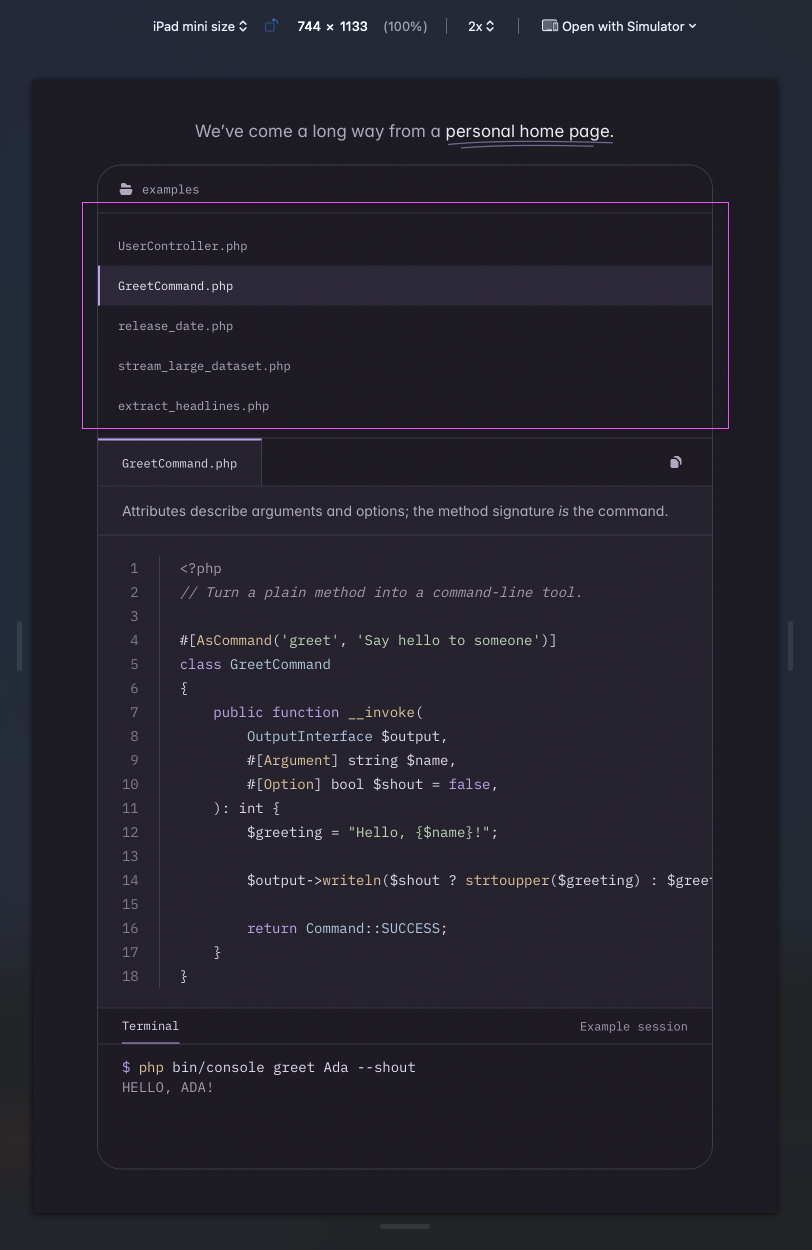
Great work! A few issues, tips actually, for mobile devices:
|

| 'url' => 'https://www.mediawiki.org/wiki/PHP', | ||
| 'icon' => 'wikipedia', | ||
| 'width' => '1.5rem', | ||
| 'wordmark' => 'Wikipedia', |

There was a problem hiding this comment.
Wikipedia looks weird to me using a sans serif font. Could the system serif stack be used?
|
This part of the hero text looks strange to me:
I don't see why being a scripting language would make PHP particularly strong on the command line. Many CLI applications are being written in Go and Rust instead, and these are not "scripting languages". (And IMHO, it's unlikely that someone starting a new CLI application would choose PHP, unless they're already working within the PHP ecosystem. I don't think it would make much sense, to be honest, so I don't see the point). |

|
Personally, I think it looks great with the original PHP logo. It momentarily snaps one out of the hypnosis that one gets when perusing an AI-forward design. 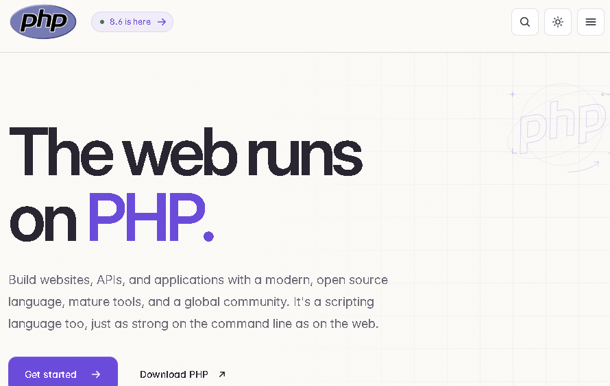
|


A new php.net homepage
Preview here: https://web-php-pr-2105.preview.thephp.foundation/
Discussion period: At least two weeks; no merge until at earliest December 4, 2026.
What is it?
This PR replaces the php.net homepage with a new design. It's the result of several months of open discussion in the PHP Ambassadors marketing group.
This PR's plans, priorities, and design have been evaluated and considered pretty extensively, but I'd especially love eyes on the code implementation, especially on these two areas:
Why now
The current php.net design launched in 2014 (2013, 2014). That's twelve years ago! PHP itself has changed enormously since then, but the front door to the language still looks the way it did before PHP 7 existed, and today the homepage is mostly a release log.
That matters because many developers still think of PHP the way it was a decade or two ago, and php.net is often the first place they check. In one of the Ambassadors group meetings, this line stuck with me:
php.net isn't the only place that work happens, but it's the one place every PHP developer--and, more importantly when convincing people PHP is viable--every curious/concerned newcomer will eventually land. Our homepage should show the language as it is today.
How we got here
This was all done in the open, and anyone has been welcome (and invited!) to join in at any point.
We're making it as a PR because the history of previous redesigns on PHP.net have been like this: a group of people openly plan a redesign, they present it for review, and then they merge it in.
Why a PR and not an RFC?
PHP's RFC process is for changes to the language, and php.net's past redesigns haven't gone through it. They followed the path this one has: a group plans the redesign in the open, presents it for review, and merges it once the feedback has been worked through. Derick helped make sure we followed that precedent here. This PR and its two-week discussion period are the review step, so this is the place to push back on any of it.
Who it's for
The goal we agreed on:
In priority order, the audiences are:
Putting existing developers third was deliberate. We're the audience that already knows our way around php.net and is most willing to take an extra click to get somewhere. Newcomers and decision-makers often get one look before deciding PHP isn't worth their time.
In practice, the extra click is small. The hero still has "Download PHP" and a "Latest releases" panel with every supported version and its changelog and upgrade links, plus the latest news. The footer keeps the utility links. And if you really just want the old homepage, it's still there at /classic/. It's hidden from search engines but available to anyone who wants it.
The design
This isn't a net-new visual identity. We deliberately built it as a continuation of what already exists:
The homepage is made up of these sections:
Out of scope for now
A few things came up that we decided to leave for later PRs, so they get their own conversations:
Feedback I'm looking for
Code examples
This is the place where I'd most love help. The examples live in
include/homepage/examples.php. Right now there are five:UserController.php: a JSON endpoint using attributes, typed properties, and constructor injectionGreetCommand.php: a CLI command defined with attributesrelease_date.php: coding against PSR interfaces with a pluggable HTTP clientstream_large_dataset.php: generators walking a file larger than memoryextract_headlines.php: fetching a page and querying it with the built-in DOM parser and CSS selectorsThe question is: what would be most compelling and helpful to someone who's new to PHP, or who hasn't looked at it in years? Suggestions for replacements or additions are very welcome. Good examples are short, show off something modern about the language, and have realistic output in the terminal panel.
Implementation
Of course, I did the best I could to match this to A) the existing code style of the site, B) the future-facing code style its phpstan/etc. guidelines expect, and C) a framework-agnostic view of what modern PHP/CSS/JS looks like today. But I'm only one person and I'd love any help necessary to make sure this fits well with the current and future php.net code.
What's in the code
public/index.php, with data and helpers ininclude/homepage.incandinclude/homepage/*.php(examples, release highlights, logos, timeline overrides)src/Homepage/, each with unit tests:FeaturedRelease: picks the newest released branch for the "Meet PHP x.y" card, so highlights for an upcoming release can be added before release dayReleaseHistory: builds the "PHP through the years" timelinePackagistStats: reads Packagist totals from a JSON file written by the backend update script, with fallback values if the file is missingbase.css,components.css,homepage.css,search-modal.css, andrelease-page.css.php85.cssbecamerelease-page.css, and the release pages now share components with the homepage.theme-medium.cssis no longer used by these pages.homepage.js(tabs, releases panel, timeline),site-header.js(theme switcher, search, mobile menu, language switcher),copy-code.js, andkeyboard.js(a jQuery-free version of the keyboard easter eggs)public/fonts/include/header.inc,include/layout.inc,include/site-header.inc, andinclude/footer.incpublic/classic/index.php, sendingX-Robots-Tag: noindexLogo wall sources
Every logo needs a public, reputable connection to PHP. Here's what each one is based on. A couple of logos from earlier drafts were removed because we couldn't find a public source.
Timeline
Comments are open for at minimum two weeks, until December 4, 2026. I'll keep updating the branch as feedback comes in. After that, unless something significant comes up, I hope for us to make the decision to merge; if further discussions is required at that point, of course we can keep it moving!
Thank you
Thanks to Jack McDade for the design, to Derick Rethans for sharing the history of designs and helping guide the process to be in line with how work has historically proceeded on php.net, to Mark Randall for the groundwork in #1962, to Roman Pronskiy and Nuno Guerra for the 8.x release page design for showing what php.net could look like, and to everyone who came to the marketing meetings, left notes, or commented on #1962.